The Evolution of the Google Logo
Google’s logo, a ubiquitous symbol of the internet age, hasn’t remained static over the years. Its journey reflects Google’s own evolution from a simple search engine to a multifaceted tech giant. Each iteration, subtle or significant, has aimed to represent the company’s current identity and future aspirations.
The original logo, designed by Sergey Brin in 1997 using GIMP, was a far cry from the polished version we recognize today. It featured the word “Google” in a serif font, with an exclamation mark at the end, reminiscent of Yahoo!’s then-popular logo. This initial design, though rudimentary, captured the spirit of the early internet – a place of experimentation and rapid growth.
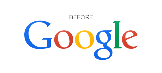
In 1999, Ruth Kedar, a Stanford design professor, created a more refined logo that became the foundation for Google’s visual identity. She chose the Catull typeface, a classic serif font that projected a sense of trustworthiness and sophistication. While the exclamation mark was dropped, the core color scheme – blue, red, yellow, and green – was retained, hinting at Google’s playful and unconventional approach.
The Kedar logo remained in place for over a decade, becoming deeply ingrained in the public consciousness. However, as Google expanded its services beyond simple web search – encompassing mobile operating systems, mapping applications, and a host of other products – a more modern and adaptable logo became necessary.
In 2015, Google unveiled its current logo, a significant departure from its predecessor. The serif typeface was replaced with a custom-designed geometric sans-serif font called Product Sans. This change signaled a shift towards a more contemporary and approachable brand identity. The new logo is cleaner, more scalable, and better suited for displaying on the diverse range of screens that now characterize the digital landscape.
The color palette was also refined, with slightly brighter and more vibrant hues. Furthermore, Google introduced a new family of related symbols, including a simple “G” icon in the brand colors and a microphone icon, further reinforcing Google’s presence in voice search and virtual assistants. These elements work together to create a cohesive and recognizable visual system across all of Google’s products and services.
The 2015 logo update wasn’t simply a cosmetic change; it was a strategic move to modernize Google’s brand and reflect its increasingly diverse portfolio. The sans-serif typeface conveys a sense of simplicity, openness, and innovation, while the vibrant colors maintain a playful and approachable feel. This evolution ensures that the Google logo remains relevant and recognizable in a rapidly changing technological landscape, continuing to represent the company’s mission to organize the world’s information and make it universally accessible and useful.
 640×289 brand google logo update from www.underconsideration.com
  1023×1599 fixing googles logo update rgoogle from www.reddit.com
  650×1036 google logo ages gag from 9gag.com
  384×288 google video search coming firefox engineer working from blogoscoped.com